
Home Price Expectations Survey: Q3 Recap
Higher-for-longer rates, sticky lock-in, and a cooling price outlook
The latest Home Price Expectations Survey (HPES) — a quarterly poll of over 100 economists, real estate experts, and market strategists conducted by Pulsenomics on behalf of Fannie Mae — is out. Alongside the price expectations data, this edition’s Special Topics module asked panelists about mortgage rates, the lock-in effect, price risk, and the primary structural factor that will shape the U.S. housing market over the next five years.
The headline price forecast
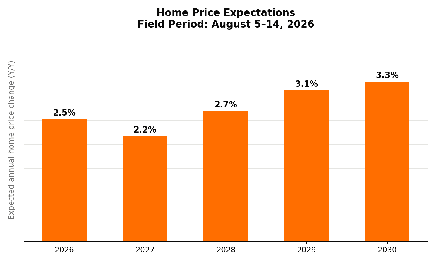
On average, the panel expects U.S. home prices to rise 2.5% in 2026, dip slightly to 2.2% in 2027, then climb steadily to 2.7%, 3.1%, and 3.3% in 2028, 2029, and 2030, respectively. Strung together, that’s a cumulative 14.6% increase over the next five years.
There’s a sharper story hiding in that 2026 figure. Actual home prices already rose 3.7% between year-end 2025 and Q2 2026, according to the Fannie Mae Home Price Index benchmark. But the panel’s mean forecast for the full year is just 2.52% — a number that only works arithmetically if prices fall by roughly 1.1% over the second half of the year. In other words, the panel may not be turning more bullish on 2026 so much as expecting its strong first half to partially reverse in the second. Only 19 of 114 respondents to the Q3 survey–just one of every six experts–projects nationwide home price appreciation ending the year higher than the 3.7% rate recorded through June.
A tale of two timeframes
Near-term: more complicated than it looks. Just last quarter (Q2 2026), the panel’s forecast for 2026 was a modest 1.72%. This quarter, that rose to 2.52%. But as noted above, that full-year figure implies an expected pullback in the second half of the year — so this isn’t a straightforward brightening of sentiment; more likely, it’s a reconciliation of a stronger-than-expected first half with a more cautious view of what comes next.
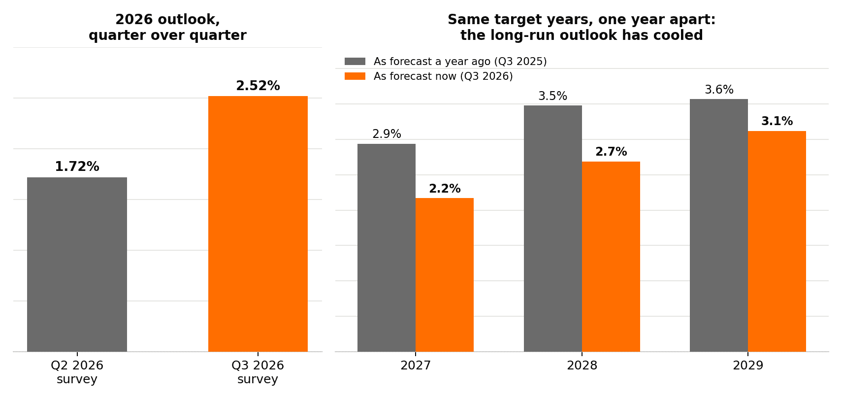
Long-term: the outlook has been cooling. Compare what the panel is saying today about 2027–2029 to what it was saying about the same period one year ago: the panel’s cumulative expectation for 2027–2029 has fallen from 10.3% (as of Q3 2025) to 8.2% (as of Q3 2026) — a more than two-point reduction in expected growth over that three-year stretch.
Mortgage rate expectations are creeping up
If you’re waiting for mortgage rates to fall anytime soon, the panel’s outlook is not encouraging. Asked whether 2026 developments have changed their long-run mortgage rate view, 48% now expect higher rates than they previously assumed, 49% see no change, and just 3% now expect lower rates (n=98).
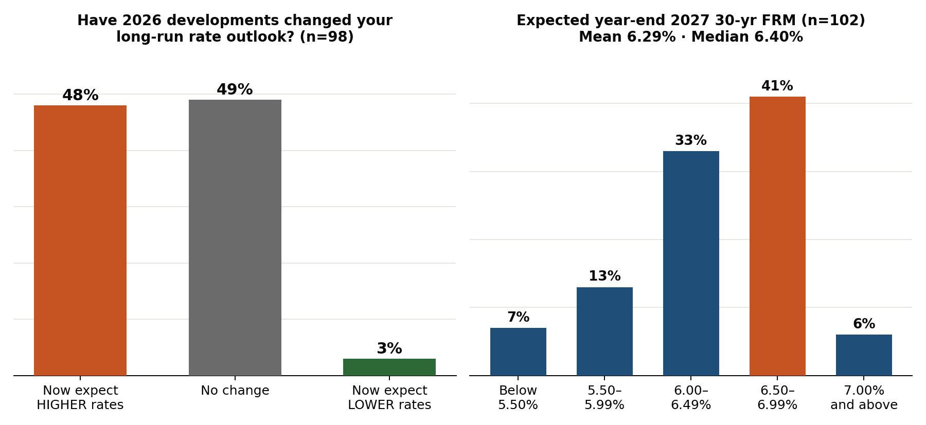
Across 102 respondents, the projected year-end 2027 30-year fixed rate came in at a mean of 6.29% and median of 6.40%, with the single largest cluster — 41% of respondents — landing in the 6.50%–6.99% band. Only 7% think rates fall back below 5.50%. That’s a panel bracing for “higher for longer,” not a return to the ultra-low rates of the early 2020s.
The lock-in effect isn’t going away soon
Prevailing mortgage rate levels have made millions of homeowners holding mortgages with much lower rates reluctant to sell — the so-called “lock-in effect” that’s been throttling existing-home inventory. Asked when lock-in will stop being a major constraint on existing-home sales (n=103), the panel isn’t expecting relief soon: less than 3% say it’s already ceased and 1% expect it within a year, while 61.2% say 3 to 5 years and another 13.6% say 6 to 10 years. Add it up, and roughly three-quarters of the panel don’t expect meaningful easing for at least three more years.

Interestingly, the panel is far more split on the deeper question of why lock-in persists or fades (n=104). 48% see it as a persistent structural constraint — elevated rates simply keep suppressing sales, effectively a new normal — while 45% think pent-up mobility needs will eventually outweigh rate sensitivity and unlock supply anyway. A further 6% see lower rates themselves as the catalyst that ends lock-in, and 1% aren’t sure. That 48/45 split is close enough to a coin flip that it’s worth watching which camp gains ground in coming quarters.
What structural force will most influence the trajectory of the U.S. housing market over the next 5 years?
Demographic change and migration patterns topped the list at 35% (n=103) — well ahead of federal fiscal policy and long-term capital costs (21.4%) and land-use and housing regulation (14.6%). Homebuilding constraints (11.7%) and the mortgage rate lock-in effect itself (10.7%) rounded out the mid-tier, with property insurance affordability (2.9%) and climate risk (1.9%) further back. Where people are moving, forming households, and aging in place, in other words, is seen as more consequential to housing’s next five years than what the Fed, Congress, or even the lock-in effect does.

One nuance to the above response distribution: while the plurality of panelists believes demographics matter most for the next five years, it holds that view with lukewarm conviction. Their confidence in the “demographics will dominate” call was middling — 49% “moderately confident” and 14% “very confident,” versus 6% “not at all” and 31% “slightly confident.” A few of the less-cited factors were accompanied by stronger conviction, e.g., homebuilding constraints (50% moderately + 33% very confident — a combined 83%), and land-use regulation (47% + 20% — a combined 67%).
Nominal numbers: not the real story
Like most home price change data, this survey’s expectations figures are expressed in nominal (i.e., not adjusted for inflation) terms. The panel-wide mean expectations imply that home values may not just fail to outpace inflation — they may lose ground in real terms over the next five years. That would make for a strikingly different headline than “home prices expected to rise nearly 15% in the next half-decade,” and it’s consistent with the more cautious mood showing up across this quarter’s other survey feedback.
Because shelter costs account for roughly one-third of the CPI basket, deriving meaningful inflation-adjusted (real) home price expectations requires applying an “ex-shelter” inflation rate to deflate the nominal projections. Ex-shelter inflation has recently ranged from roughly 3.5% to 4.6% annually, with the latest acceleration driven in part by a sharp energy-price shock.* Compounded over five years, either rate would be sufficient to turn a positive nominal home price projection into a negative real one.

*There’s no market-based, forward-looking measure of “ex-shelter inflation” as there is for overall inflation (e.g., via Treasury Inflation-Protected Securities). The figures above blend two different kinds of estimates, from different months: an estimated 3.5% as of July 2026 (the author’s own calculation, derived from BLS’s official CPI component data for that month) and as high as 4.6% in May 2026 per Texas A&M’s Real Estate Research Center, which attributed that spike to gasoline and energy prices tied to the Middle East conflict (neither figure is a market forecast in its own right). It’s also worth noting that even ex-shelter CPI isn’t a perfectly analogous benchmark for a housing-price series: CPI shelter measures rent and owners’ equivalent rent (a consumption flow) while HPES measures home values (an asset price). Thus, although excluding shelter from the deflator avoids comparing housing to itself, it doesn’t make the two series perfectly comparable.
Dispersion
Optimists vs. Pessimists
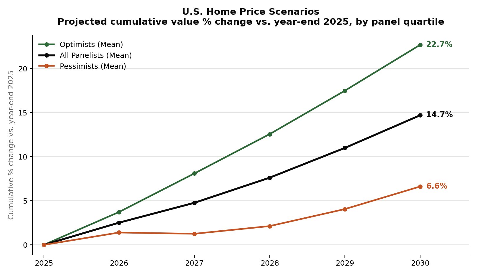
By 2030, the panel-wide average points to 14.7% cumulative appreciation — but the most optimistic quartile of panelists is tracking toward 22.7%, while the most pessimistic quartile sees just 6.6%. That’s a roughly 16-point gap between the two camps.
Just as telling is how that gap opens up over time. In year one (2026), optimists and pessimists are only about 2 points apart (3.7% vs. 1.4%). By 2030, that gap has grown to 16 points. The dispersion compounds, the same way the price changes themselves do.
That spread is itself a signal. A tight gap between optimists and pessimists would suggest strong consensus; this widening gap suggests real, growing uncertainty about how the next five years play out.
Zooming out from any single quarter, HPES has been tracking a version of this optimist/all-panelist/pessimist split since 2010. Each point here is the average annual panel-wide expectation for that survey edition:

By this measure, the panel’s average bottomed out at just 1.1% in Q3 2011, deep in the post-financial-crisis recovery, and peaked at 6.2% in Q4 2021, at the height of the pandemic-era housing boom. Today’s reading sits well below both extremes — closer to the more typical 3%–4% band that held for most of the 2013–2019 period.
The gap between optimists and pessimists tells its own story. It was widest by far around the 2021–2022 boom and the rate shock that followed — optimists near 8% while pessimists briefly went negative — and has been compressing pretty steadily since.
Intra-panel Standard Deviation
We can also measure how much individual panelists’ forecasts differ from each other for any forecast horizon. For example, for each survey edition, we calculate the standard deviation of panel-wide expectations for each of the years being forecasted, and then average them. The solid black line in the chart below reflect those dispersion data.

This dispersion measure bottomed out at 1.4 percentage points in Q2 2015 — a calm, low-rate stretch — and peaked at 3.6 points in Q2 2022, right as mortgage rates were in the middle of their fastest climb in decades. Notably, it has been falling since that 2022 peak even as mortgage rates have stayed in the 6%–7% range — suggesting it’s less the level of rates that drives panelists apart and more the speed at which they’re moving. The current reading, at roughly 1.5 points, is back near the most unified readings in the survey’s history.
The bottom line
- The panel’s near-term price outlook for 2026 brightened notably from last quarter — but its long-run outlook (2027–2029) has cooled compared to a year ago, even for the identical target years.
- Math implies a second-half pullback: with 3.7% already realized through Q2, the panel’s 2.52% full-year 2026 forecast is only consistent with roughly a 1.1% price decline in the second half of the year.
- Mortgage rate expectations are drifting higher: 48% of panelists now expect higher long-run rates versus 3% expecting lower, with a median year-end 2027 estimate of 6.40% on the 30-year fixed (mean 6.29%).
- The lock-in effect looks sticky: 61.2% expect it to keep constraining sales for another 3–5 years, and the panel is nearly split on whether it’s a lasting structural constraint (48%) or something pent-up mobility needs eventually overcome (45%).
- The long-run outlook keeps cooling: the panel’s cumulative 2027–2029 expectation has fallen from 10.3% (as of Q3 2025) to 8.2% (as of Q3 2026) for the identical three-year stretch.
- Demographics, not rates or policy, are seen as the biggest long-run force shaping housing over the next five years — cited by 35% of the panel, well ahead of fiscal policy/capital costs (21.4%) and land-use regulation (14.6%) — though panelists hold that call with only moderate confidence compared to their more concrete views on homebuilding constraints.
- Adjusted for the rising cost of everything besides housing, the nominal 5-year price gain the panel forecasts may actually represent a real-terms decline.
Taken together, the throughline across both the core forecast and the special topics answers imply caution. The panel certainly isn’t calling for a crash, but seems to be leaning more defensively than it was three months ago — on prices, on rates, and on how long today’s affordability squeeze sticks around.
About the Home Price Expectations Survey: HPES is a quarterly survey of over 100 economists, real estate experts, and investment and market strategists, conducted by Pulsenomics LLC on behalf of Fannie Mae. Survey benchmark: Fannie Mae Home Price Index (FN-HPI, NSA).